Wealth and Redistribution Revisited: Does Enriching the Rich Actually Make Us All Richer?
Update: There is a revised and corrected version of the model and spreadsheet here, with discussion.
In a recent post I built a model with one rich person and ten poorer people to ask: does redistribution from rich to poor make us all more wealthy? The conclusion was Yes. Jump back there to see a quick rundown of the model’s assumptions.
Michael Sankowski at Monetary Realism put the model through its paces, and provide feedback by email. He pointed out one very interesting thing: total wealth accumulation in the model increases (faster) with redistribution in both directions — from rich to poor and poor to rich.
(Note that redistribution could take infinite forms — traditional welfare, education and health-care spending, tax preferences for rich people’s investment income, corporate subsidies, etc. This is systemic redistribution we’re talking about here. Like this model, the system just does it.)
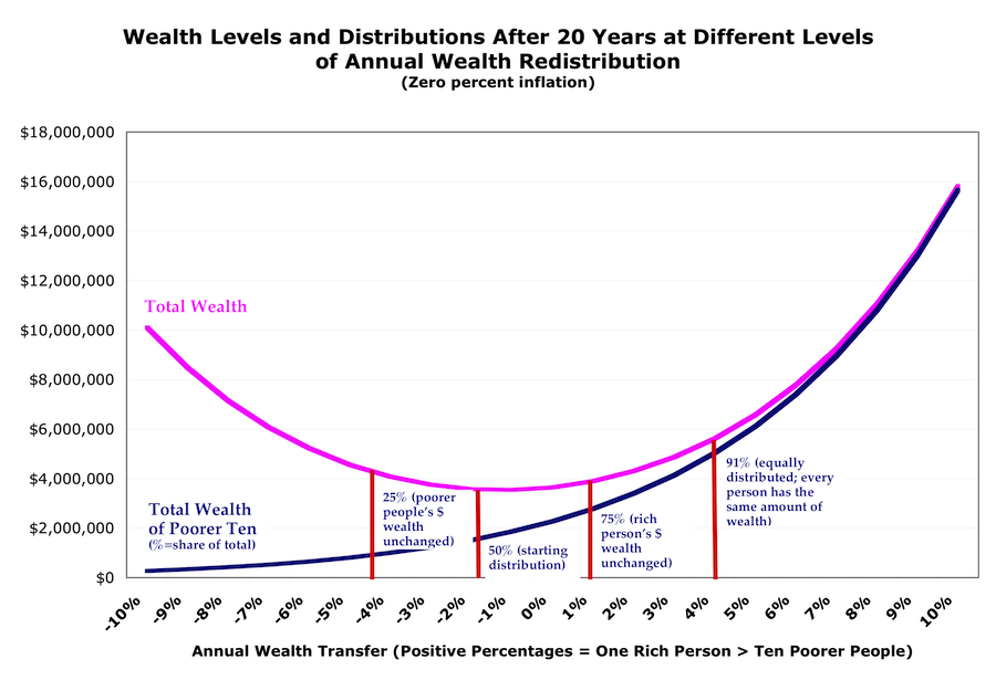
Here’s what that looks like, with starting wealth of $2 million, divided 50/50 between the rich person and the ten poorer people. (click for larger):
(Since income in this model is based on spending from wealth, the income curves look similar to these wealth curves.)
It sure looks like giving more money to rich people does make the pie bigger — just not as fast or as much as giving more money to poorer people.
Since the model is based on the idea that poorer people spend more of their wealth each year, so giving them more money increases money velocity hence GDP and eventually wealth, this seems weird. But here’s the explanation: there’s a zero lower bound on poor people’s spending. It can only decrease so far, and so fast. Rich people’s spending can keep increasing with no constraints.
So as you transfer more wealth from poor to rich, the poorer people’s spending doesn’t decline as fast as the rich person’s spending increases — even though the poorer people spend a far larger proportion of their wealth than the rich (here, 80% vs. 30%). The zero-bound effect overwhelms the velocity effect.
Except. There’s a flaw in the model: as I’ve said, it assumes no behavioral responses — only that production (and the surplus from production) are driven by spending, with that whole process relegated to a black box. More spending yields more production and more surplus, with those received as income proportionally to each person’s spending. And spending is based on wealth.
But at the left side of the curve, where the rich person starts getting all the income, doing all the spending, and holding all the wealth, the poorer people have no incentive to work. (Their time is much better spent storming the castle with torches and pitchforks.)
If the poorer people have no incentive to work, there are no goods for the rich person to buy. Spending, income, and wealth would all go negative. So you would inevitably expect the left end of the income and wealth curves (like the peasants) to bend over and di(v)e eventually.
But for quite a ways along the left side of the graph, we’re not at that point. People have plenty of incentive, actually increasing incentive, until they actually are starving: they need to keep their families from starving, get health care for their kids, keep a house over their heads. So the bulk of the graph does yield lessons.
Here’s the most interesting one, to me: the smallest wealth accumulation in this model occurs at the point that maintains the status-quo wealth distribution. (Where there’s a 1.4% annual wealth transfer from poor to rich.) Everybody stays the same relative to each other, and the pie does get bigger (there’s a 5% surplus every year!). But it ends up being a smaller pie than with any other redistribution scheme.
Another lesson here: trickle-down actually works! Compared to zero redistribution, transferring 1.4-4% of poorer people’s wealth to the rich person results in everyone getting wealthier (again, compared to no redistribution), including the poorer people. Move to the left of that, though, and the poorer people get poorer while the the rich person gets richer.
And everyone, poor and rich alike, gets wealthier faster if you redistribute in the other direction — from rich to poor. Compare:
| Ending wealth in millions after 20 years if you transfer 1.5% of wealth annually (starting wealth $2 million divided 50/50): | |||
| Rich One | Poorer Ten | Total | |
| Rich to poor: | $1.0 | $3.1 | $4.1 |
| Poor to rich: | $1.8 | $1.7 | $3.5 |
Remember that this model assumes no inflation, so in the top line the rich person’s real wealth is unchanged.
Note that these redistribution percentages are just illustrative. They’re nothing like policy proposals. The turning points and break points all depend on what parameters you plug into the model. But the shape of the curve, and the concepts that emerge, remain unchanged.
Finally, note this: If we redistribute enough (rich to poor) to actually reduce rich people’s dollar wealth, the pie gets much bigger, much faster.
And if you add the notion of declining marginal utility of spending and consumption, the aggregate utility pie gets even bigger, even faster.
Cross-posted at Asymptosis.
Why not just throw money at everyone? Is there a shortage of paper or ink?
And if, at some future time, Aggregate Demand was too big, and we wanted to reduce it, would it be OK to use your model to argue that we should redistribute wealth from poor to rich?
Wealth will be distributed one way or the other. Why not distribute it in the direction that helps everyone, rich and poor, the most?
@Nick: I think you’re saying that since MV = Y, it doesn’t matter if we increase M or V. Same result.
I think you’re also suggesting that the only thing happening on the right side of this graph is a V increase.
But: if we *decrease* M, do we get the results we see on the left side here?
Does MV explain this U-shaped graph? Maybe it does and I’m just not getting it…
And I haven’t heard from you on the aggregate-utility (and hence work-incentive) increase discussion that I tag on to the end of each of these posts.
Probably unquantifiable but there is a tipping point, now passed I maintain, where so much money is concentrated in the assets of the wealthy that the continued inflation of those assets is assured. With it must be noted the intervention of the monetary authorities. Thus inflated ‘wealth’, by definition is greater.
‘Wealth’ thus is now a monetary phenomena. While a growing plurality and probably soon a majority will be increasingly poor, in aggregate ‘wealth’ will continue to increase. This metric in hand will assure the continuation of current policy.
Or simply, wealth is now an almost purely monetary phenomena.
I anticipate that the Fed expanding its balance sheet by about a billion over the next year will help to assure the continued inflation of financial assets, the assets of the wealthy. Depending on how much inflation leaks down to citizens cost of living their wealth, such as it is, will decrease, save if residential real estate continues to inflate a bit. That doesn’t really matter however in the big picture of wealth measurement.
In the end the threat of the deflation of financial assets will guarantee another round of Fed balance sheet expansion, so that our ‘wealth’ will not be threatened. And so on and so on, until………..
A trillion, obviously
I think our model overestimates how much the rich will spend as opposed to saving i.e. removing from the economy. Empirical evidence shows that there is an actual barrier at which point the rich spend much less, and since a lot of the money the rich spend goes towards investment, they stop spending when the poor get too poor to provide a suitable market. We’ve seen this again and again.
On the other hand, it is good to see someone trying to create a useful, rather than fanciful, economic model.
And now for a slightly tangential direction. Did you see Bartlett and Yves Smith on Moyers&Co. last evening? Here is the link (its on Moyers’ web site) http://billmoyers.com/segment/bruce-bartlett-and-yves-smith-on-overhyping-the-fiscal-cliff/
and it’s well worth the watch. Yves is, as we should expect on target placing much of the blame for the “fiscal cliff” drama on the Big O, where it belongs. They are both very critical of O’s intentions regarding so-called entitlements. One is left wondering why anyone would deny the validity of what Yves has to say about the issues of the budget, the fiscal cliff, national debt and Obama’s intentions.
Very interesting piece Steve! I think that in reality, another reason that you wouldn’t be able to generate as much demand through the consumption of the wealthy is they have a lower propensity to consume.
I mean no matter how big a spendthrift you are as wealth increases you progressively consume less as a percentage of income up to a point were no matter how much new income you get, it’s not going to be spent on consumption.