Another look at Spending and Revenues
This is more or less relevant to Beverly’s post from earlier today.
Therefore, some prominent voices have found it necessary to sing out again against the lie. I will add my humble quavery baritone to the chorus.
Here in Graph 1 is Kevin Drum demonstrating how Real Government Expenditures per Capita have changed under the last three presidents.
What we have isn’t a spending problem. That’s under control. What we have is a problem with Republicans not wanting to pay the bills they themselves were largely responsible for running up.

By using real [inflation adjusted] and per capita numbers, Drum has introduced a couple of denominators. Real expenses per cap is a rational way to display the data, but not the only way. So lest someone cry out about that ol’ devil denominator, let’s have a different look.
Via Paul Krugman we get Graph 2 and Graph 3, from FRED, showing total Government expenditures and Federal Government expenditures, respectively, on log scales.


Yes, you can argue that spending was growing too fast under Bush, although it’s funny how few deficit scolds saw fit to mention that at the time. Or you can say that you just want less spending, although as always people who say this tend to be short on specifics. But the narrative that says that spending has surged under Obama is just wrong – what we’ve actually seen is a slowdown at exactly the time when, for macroeconomic reasons, we should have been spending more.
Remember, a log scale represents constant growth as a straight line, and zero growth as a horizontal line. So, in pure dollar numbers, spending hasn’t quite declined, but it has stagnated to almost zero growth. Hence Drum’s decline in inflation adjusted, per capita terms.
In Graph 4, we get one more longer range look, using Krugman’s data series, this time on a linear scale. Also presented is the difference between the two, which is the amount of spending by state and local governments.
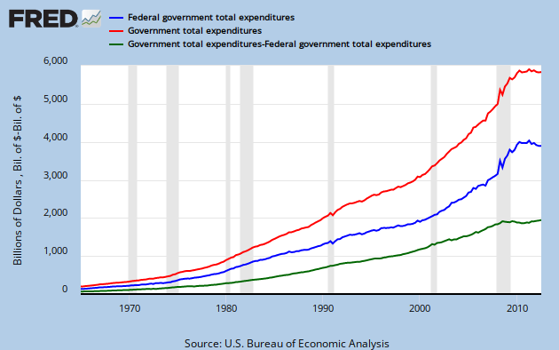
The red line is total spending at all levels of governemnt, the blue line is federal only, and the green line is the difference, state and local spending. Note that the green line flattens early in the recession
To bring things full circle, Graph 5 shows Federal Government current receipts. Look at this and tell me we don’t have a revenue problem.

To drive this point home, Graph 6 shows Federal Receipts as a fraction of GDP. The purpose of the ratio is to provide context, using GDP as a proxy for the size of the economy.

As you can see, revenues/GDP are in a historically low range.
Conclusions:
– Federal spending is flat in nominal dollar terms.
– Federal spending is declining when adjusted for inflation and population growth.
– Federal revenues are far below trend lines based on any historical reference you chose.
– Federal revenues as a fraction of GDP are historically low.
– The Republican claim that we have a spending problem not a revenue problem is simply a lie, on both counts.
– Disproportional spending growth has only occurred under two presidents: Republicans Ronald Reagan and George W. Bush.
The simple fact is we have a revenue problem, not a spending problem.
Why do Republicans lie?
The truth is hostile to their agenda. PK Explains.
Cross posted at Retirement Blues
I have seen so many charts and all of tem were indicating that the best financially stable times that experienced this country were when Bill Clinton was our president. He is an excellent economist. Unlike Bush and possibly Obama (it is still difficult to judge because he received America when it was harshly ruined by Bush). I wonder if we will ever live in more or less stable environment. Enough to take a look at record low federal revenues. You know, people will not been even able to apply for instant online payday loans online
One of my greatest frustrations is trying to talk to people who prove the old adage that if you tell a lie often enough, it becomes accepted as gospel.
I find myself screaming at political talk shows when the deficit is discussed and the ‘fac’ that “everyone knows” we have a spending problem is repeated as if it just came down from Mt. Sinai. I want to scream that if our so-called “liberal media” really was, or even if they did their damn JOBS as reporters instead of robotic talking heads, “everybody wouldn’t KNOW”, the lie. The right-wing echo chamber has succeeded beyond their wildest dreams.
If GDP has recovered to pre-recession levels, and Bush income tax rates didn’t change before 2013, then I’d expect that federal revenue from individual and corporate income taxes, as a percentage of GDP, also has bounced back. It was 11.1 percent of GDP in 2007, dropped to 7.6 percent in 2009 and 2010, and I think it remained in single-digits for 2012. This makes sense if the recovery has been unevenly distributed across sources of income that are subject to different tax rates; that is, if the recovery has favored low-wage jobs and non-wage sources of income, which are subject to low tax rates, rather than the incomes of middle-class wage-earners. Unless I’m wrong about this (surely a possibility), the revenue problem is rooted in the lack of good-paying middle-class jobs and the low tax rates on high incomes and non-wage income.
PJR –
Where are your numbers coming from? They don’t agree with my graph 6.
I agree with your last sentence.
JzB
Jazzbumpa, I’m referencing federal individual and corporate income taxes, as reported by OMB in the historical tables the President’s FY 2013 budget proposal. See e.g. Table 2.3 here http://www.whitehouse.gov/omb/budget/Historicals I believe your figures include all sources of government revenues (like excise taxes and Social Security contributions). I’m focusing a subset of your data to make a different, but related, point about revenue shortfalls.
PJR –
You’re right. I believe the FRED data does include those other things.
Thanx,
JzB