Where Has All The Money Gone, Pt I, Corporate Profits
INTRODUCTION
1) Rethug Speaker of the House John Boehner says that as a nation, “we’re broke“; Rethug presidential candidate Ron Paul claims America “should declare bankruptcy.” I say these two are liars, and at least one of them is crazy.
2) Tyler Cowan says “we are poorer than we think we are,” due to mis-measurement of value, which might be true. I believe his prescription for recovery is generally very bad, though.
3) In comments to my previous Angry Bear post, Bob McManus directed us to the writings of Michael Hudson, where we find his post Democracy and Debt. This is must reading. The relevant point here is that the increasing capture of wealth, as rents, by a creditor class impoverishes society in general, and this eventually leads to severe repression, major social upheaval, or both. I whole-heartedly agree.
4) Jon Hammond’s guest post at Angry Bear shows that a more-or-less continuous decrease in real investment has occurred during the post WW II era.
In this series of posts, I intend to show that we are a wealthy nation, but that our wealth has been increasingly captured by elite creditors, who, in my opinion, are strangling the economy by 1) extracting excessive rents and 2) diverting this wealth to financial tail chasing, rather than real investment.
Here is a look at average hourly earnings, the typical income of a working stiff, presented on a log scale.
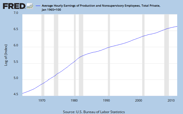
Like almost every time series you can imagine, including GDP, it exhibits a break near 1980. The break is always to lower growth. But, compared to most other data series, this break is especially sharp.
Hear is the same series compared to GDP, an approximate measure of the income of the nation, on a linear scale. For this graph, each is normalized to a value of 100 in Q1, 1965.

While earnings have grown less than 8 times in 47 years, GDP has grown more than 20 times.
Clearly, the money has not gone to compensation of the workers whose labor actually creates the wealth of the nation. That might explain some of the alleged envy.
CORPORATE PROFITS
As a first step in finding where the money has gone, let’s consider the growth of corporate after-tax profits since about 1950. You can see it in this FRED graph. It’s on a log scale, so constant growth would be a straight line. There are lots of wiggles, but I see an increasing slope over time, and it’s not an optical illusion.

There are a lot of ways to parse this. One is to connect the dip bottoms with straight lines. I’ve done that with alternating red and blue to show the slope increasing over time. The problem is selecting which bottoms to connect. Some alternate choices are indicated in yellow. The yellow lines define times of above normal profit growth: 1970 to 1980, 1986 to 1998, and 2001 through 2007. Each of them leads to a correction, indicated by a purple line across the top of the decline.
After I did all that, it occurred to me to let Excel throw an exponential best fit line on the data set, and you can see that as well.
I see now that I could have included another yellow line from 1961 to 1967. Notice that with each yellow line, the data set advances above the exponential best fit line before a sideways correction takes it below again. After the correction is complete, profits increase again until the best fit curve is breached. Or, they did until now.
Remember that on a log scale constant growth rate is represented by a straight line, and that the growth compounds, so that the underlying increase is exponential. Sooner or later, that has to end. Nothing in the real word can go to infinity. Here we see an exponential curve on a log scale. This demonstrates an increasing growth rate. Therefore, the underlying increase is greater than exponential. If exponential growth is unsustainable, what would you say about greater than exponential growth?
In fact, the whole trend might now be falling apart, as the last blue line has a much lower slope. Also, for the first time following a correction, profits have stayed below the trend line, and the gap is increasing.
To show the extent of national income capture by corporations, here is a graph of corporate profits as a percentage of GDP. I’ve divided the set into two segments: 1951 to 1979, and 1980 on, and had Excel place a linear trend line on each. This division is somewhat arbitrary, but almost every economic time series you can find has a break point within a few years of 1980. Division between ’79 and ’80 is the least favorable to my point that Profits/GDP had no trend in the post WW II Golden Age, but have trended sharply upward during the Great Stagnation period.

Profit/GDP growth was unusually poor from 1980 through 1986. Then from late 2001 through early 2006 it exhibited the greatest growth ever. But remember the denominator effect. Nominal GDP growth increased rapidly following the ’80-’82 double recession; while GDP growth in this century has been generally slow. The financial melt-down of 2008 caused a dip that was sharp and brief, but the rebound has not gone to a new high. But even now, in the midst of anemic recovery, profit/GDP is hovering in the 9 to 10% range, far above historical norms.
CONCLUSION
The corporate profit growth picture looks unsustainable, and that is troubling. What it means for the future is anybody’s guess. But, what we get from it is the first partial answer to the question, “Where has all the money gone?”
Gone to profits, everyone.
A slightly different version is posted at Retirement Blues.
So is income earned from overseas operations being compared to only a pool of US workers?
In conserva-land the economy is always, and shall forever be, lacking capital (we must lower taxes for capital creators!), while back in realityland, lack of demand has always been a leading source of economic instability.
Another aspect of too much money at the top: it reduces interest rates, which makes it much more difficult for the middle class to save for retirement.
The Treasury should issue ‘middle class bonds’ that pay inflation + 4% so that regular schmucks have some incentive to save.
mcwop –
Not every corporation is a trans-natiional mega-corpration.
This is aggregate data. I got it from FRED. It tells a story. If you don’t like the hourly earnings part, ponder the GDP part, whilst rememberng the difference between GDP and GNP.
eight-etc.
Novel notion. I like this better than applying penalties to debt owed.
Cheers!
JzB
If you do trend analysis of the S&P 500 earnings per share the trend growth rate since WW II has been 7%.
It is just now returning to that 7% trend line for both reported and operating earnings after the great recession.
From 1958 to 1995 there was a very solid relationship between interest rates and the stock market PE.
So it was very simple to view the market PE as an expression of the present value of a perpetual stream of 7% earnings growth.
But over the last year or so that tight relationship between interest rates and the market PE has broken down. A regression based on that relationship from 1958 to 1995 says that the current market PE should be 19, but the current PE on trailing operating earnings is just 13.
This suggest to me that the market is discounting some major new risk besides the risk of tight money.
Maybe it is discounting the possibility that long term trend earnings growth has broken down from the post WW II trend of 7% growth.
A significant part of the 1980 trend breakout that Jazzbumpa has identified stemmed from a slowing of nominal GDP growth, not an acceleration of profits growth. In the 1970s nominal GDP growth was around 10%, so a 7% increase in profits meant that GDP was growing faster than profits. But from the recovery from the 1980 recession to the great recession nominal GDP growth averaged 5.5% so the same growth of profits meant that profits was growing faster than GDP.
PS. Trend growth for profits as measured in the GDP accounts is faster than for S&P 500 EPS growth.
P.S. If you do profits as a share of GDP from 1948 to now and calculate the trend as a parabola it makes a very nice chart.
Any post using the term “rethug” is not worth reading. how about some grown up conduct here?
spencer –
Do I detect a post coming on?
JzB
rusty –
My first response vanished into the ether.
Look, if you disagree with me, that’s fine. But if you are going to call for mature behavior – well, first off, Im not likely to comply – but you might also consider giving some substantive criticism. Am I wrong? Why do you think so? What is your alternate narrative? What data supports it?
Re: “Rethug” – we have a major political party whose stated goal is to make the sitting president fail. There is no precedent for this with any other president. There is no consideration of the collateral damage to the rest of the country. Filibusters are at record levels. Anything the president proposes, they oppose, in knee-jerk fashion.
The Rethug party has nothing to offer, so they lie. They are shills for the 1%. Unless you are in that elite group, they have nothing to offer you.
So – yeah – Rethugs.
JzB
No. Why do you ask?
JzB
One way to save is through FICA contributions to SS. The SS treasuries held in the TF pay interest (4%, IIRC) which is returned to the TF for use in current and future benefit payments. SS is like a big mutual fund invested in fail-safe same as cash treasuries. It’s a great system. Which of course is why it’s too good for the likes of ordinary people and must be destroyed. 😉
I’ve often thought that some kind of enhanced retirement savings bonds might go a long way toward reducing debt the govt owes to foreign creditors. But, no signs of interest in this idea in Congress. NancyO
JzB,
During the first two years of Pres Obama’s administration he had veto proof majorities. President Obama could have passed anything he wanted, could have exited from Iraq by June of his first year, ended all those laws that the left screamed about under Bush Jr. Closed Gitmo, got out of Afghanistan. You name it.
Yet he couldn’t even convince his own party to pass much legislation. Couldn’t even close Gitmo which is well within his ability (but would require hard decisions that could come with a political liability). Then he was seriously rebuked at the 2010 mid-terms (it took the evil Bush Jrs 6 years to lose Congress, and he won re-election fairly easily over the hapless Kerry). You will note during all those protests at the mall under Bush Jr, Bush Jr still managed to get overwelmingly bi-partisan support for the wars, passed budgets, worked with the late Ted Kennedy to pass No-child-left-behind, increased the Medicaid entitlements, etc, etc. Even after the Dems took over Congress in 2007. (Which BTW, you will note is when the wheels started coming off the economy, but I digress).
So now you want to blame the Reps for Obama for being unable to actually govern as effectively as Bush Jr. That Obama is not even up to comparison to “the worst President ever.” That right?
And all the snark aside. If my senator and congresscritter don’t beleive legislation is good for the country I expect them to vote against it reguardless of who’s in the White House. Or is that concept a little to hard for you to grasp?
But its all Bush’s fault…
Islam will change
buff –
Nice rant.
What does it have to do with my post? Where did I mention Bush? Where did I accuse anyone of anythng other than mendacity and insamity?
Again, I don’t mind people disagreeing with me, but how about getting to the meat of the post instead of digression down a side path because I used a snarky, but well-deserved term?
Corporate profits, GDP, and wages are all on-topic. Capiche?
JzB
Jazz:
I have to agree with you about the party of “No”rquist whose pledge is to Norquist to represent his demands and not the desires of the constituency who elected them in the first place. The Repubs have not represented the people in a long time; and unfortunately, the Dems have not done much better.
A good post.
Quadratic?
run –
Thank you.
Back in 1962, my dad told me: “Every once in a while, if a crumb falls off the plate, the Democrats will let you keep it. The Republicans won’t even do that.” At the time, I didn’t get it. But I remembered it. I get it now.
Cheers!
JzB
Why would US workers necessarily share in foreign corporate profits?
http://media.mcclatchydc.com/smedia/2011/03/28/12/20110325_ECONOMY_PROFITS.large.prod_affiliate.91.jpg
Boehner: We’re broke.
Obama: We’re out of money.
Moi: Why don’t you both resign? If we had the money to bail out the banksters, we have the money to bring down unemployment and generate a real recovery. Why should the many bear the burden for the mistakes and misdeeds of the few?
Jazzbumpa:
While I agree with your post, I also think that being snarky is going to leave you preaching to the choir. All very well if you want to doo is just rally the troops. But to avoid the knee jerk reaction among the unconverted, and instead perhaps getting them thinking about substance, you might wrap your anger in velvet. The ‘Rethuglicans’ may have earned your contempt, but treating those who differ with them contemptuously is what they do. You want to be better. PS:
http://www.anamecon.blogspot.com/2010/12/our-government-is-captive-of-wealthy.html
Another old bromide told to me by an older gentleman in a bar: “When it comes to money, its a matter of whether the Dems can give it away faster than the Repubs can steal it.”
Graph 3 is labelled “But a growing share of profits comes from foreign subsidiaries.” But the amount from foreign appears steady to slightly down, while the total is onsiderably higher. Whoever labelled the graph screwed up.
At any rate, the foreign amount, aside from the depth of the recession, is about 1/3 of the total. I don’t feel too bad making a generalization based on 2/3 of the total.
Graph 4 is especially interesting. Even with the two dips, generally increasing productivity. Meanwhile, wages over the last decade have been flat. All productivity gains have fed into profits. Makes my point perfectly.
JzB
Why should the many bear the burden for the mistakes and misdeeds of the few?
I think that has something to do with who holds the power, and what their ultimate goals are.
Viewed from the right perspective, Reaganomics has been a great success.
Sadly,
JzB
Greg –
Yeah, you’re right.
But, what I’ve seen here over the years is that being a perfect gentlemen, like Mike Kimel has unfailingly been, has not changed a single mind. The same people who focus on an irrelevant point of vocabulary are also immune to facts and data. Unable to mount a rational contrary argument, they change the subject. Seriously, watch for it. Happens all the time.
Still, you have a point, and one does well to not foreclose the option prematurely. Odds are slim but a miracle might happen.
I’ll keep that in mind.
But Boehner and Paul are still Thugs.
JzB
Graph 3 is a short time frame, go back to 1980 and look at that growth.
But, I agree there is a story here just not sure all the right things are being considered. The past two decades our economy has shifted to IT, where there are big profits but fewer employees. A mature manufacturing base, means a lot of low skilled job growth has been in low level services like Wal Mart, Starbucks, and McDonalds.
Now how to solve the problem, I think there are ways, and none require higher tax rates, but do require changes to the tax code.
Greg-
Avoiding “knee-jerk” reactions by the “unconverted” is easier said than done. Many of them seem to be living in an alternate reality…
Consider Buffpilot- in his world, Obama had “veto-proof” majorities in his first two years; in our world, he had a narrowly split Senate, in which the R’s fillibustered a record number of times in order to block as many of his policies as they could.
In Buff’s dimension, the newly elected democratic congress apparently had a “wayback machine” and caused the preceding housing/credit bubble and subsequent financial crash.
Where Buff resides, the R’s only vote against stuff that is “bad for the country.” In our world, they vote against policies they originally proposed solely to make sure the democratic president fails.
I don’t understand it myself- Buff does not seem to be either stupid or malicious- but wtf? Islam may indeed change. Can Buffpilot change?
Jazzbumpa-
Who said you have to be a perfect gentleman all the time? Whining against bringing up sensitive phrases, like ‘class wrfare,’ which it seems is rude to suggest to them, as real as it has been these past 30 years, is another of their techniques. But it is usually better at least to build to your climax. ‘Labelling’ should be a conclusion rather than an assumption.
And Buffpilot at least is talking here. Most who express views like his don’t have the time of day for this. Maybe it’s a feeling he’s got, that all is not right with his view of the world.
And Jazzbumpa- I do like pictures, and look forward to more of what you have to say and show.
And Ron Paul does have a few interesting things to say about individual rights. Boehner?