Saving, Investment, and Lending in the Real Economy (Graphs). S=I?
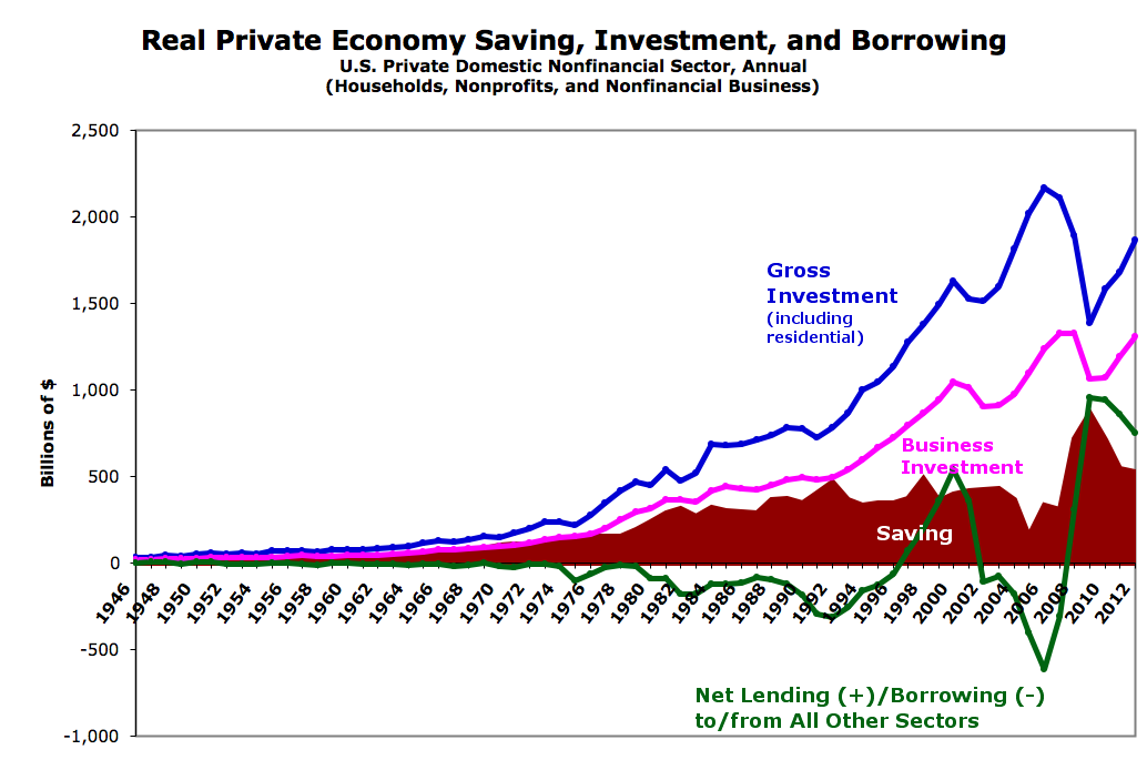
With all the chaff that’s been flying around (recently, and for years now) about saving and investment, dissaving, and lending/borrowing, I felt the need to go back to the numbers and see how they’ve played out over the decades in what we tend to call the “real” economy — domestic households and nonfinancial business. Click for larger:
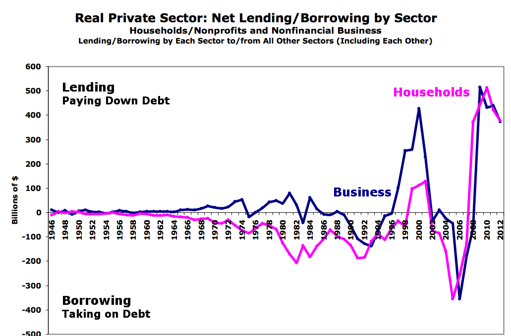
Update: The signs were reversed for lending/borrowing. Graphs corrected and updated.
Here’s the lending/borrowing broken out for you:
This is all from the Fed FFAs. Saving is household/nonprofit net saving (after-tax/transfer income minus expenditures) + undistributed business profits (after-tax/transfer income minus expenditures and distributed profits [distributed profits are part of household income]). Details/spreadsheet on request.
I’ve actually written at least three (long) posts on this in course of building out these graphs, but now that the graphs are complete I find myself fairly flummoxed. Saving seems to always be wildly insufficient to fund investment (and no, lending/borrowing + saving has no relationship either). S=I seems to provide exactly zero illumination here.
And the post-1990 lending/borrowing swings I see don’t fit with any real-sector saving/dissaving story I’ve heard (or can remember). We see borrowing spike during the internet boom, dive following the bust, then spike again during the real-estate bust. ?
So I’m going to leave this open to my gentle readers for the moment. What in the heck is going on here? What story (or stories) would you tell to explain what you see?
If anyone wants to see earlier periods zoomed in to get a better feel what’s going on, let me know. I’m thinking 1946-1975 (to see what seems like a period of consistency), and 1970-1990 (from the fall of Bretton Woods to the start of the internet bubble and the Clinton surplus).
Cross-posted at Angry Bear.
Good series Steve…hope this gets lots of comments
Nice to see some facts finally intruding into this debate.
Firms have always financed the majority of their investment in productive capital by the use of retained earnings. See for example: ‘Corbett J, Jenkinson T, 1997. How is investment financed?’ or table 2.1 in Godley & Lavoie; which shows that the US business sector was both ‘saving’ and ‘investing’ at the same time for the last 60 years.
Marx and Kalecki got this right, Keynes (and bizarrely, Godley) got this wrong.
Implicit in almost all economic modelling is the assumption that domestic saving funds firms investment. In fact productive capital is so efficient that it doesn’t need help from households.
The bit of real capital that does need help is housing – fully half of all real installed capital. Even in rich countries many live in poor housing. In the modern age business generates funds which are provided to householders to build houses. The problem of course is that housing is not productive capital. So build too much of it too quickly and the productive sector struggles.
The economic modelling S–>I link is exactly opposite to the real world link.
Basic economic models should start with investment based solely on retained earnings.
To see what can be achieved when you model in this way see:
http://www.pepov.org/sites/default/files/willis_why_money_trickles_up.pdf
Post 1990, are we seeing the results of the government “saving” via deficit/debt reduction? Does this make (I forget his signin name) postion that we need more government spending/deficit too small agrument?
The lines of your second graph seem to follow the swings in the government shift to balancing the budget (clinton) to busting the budget (bush wars, drug benefit, tax cuts) back to deficit reduction. Pre 1990 there was no actual implementation of such policy. Instead there was inflation deficit reduction.